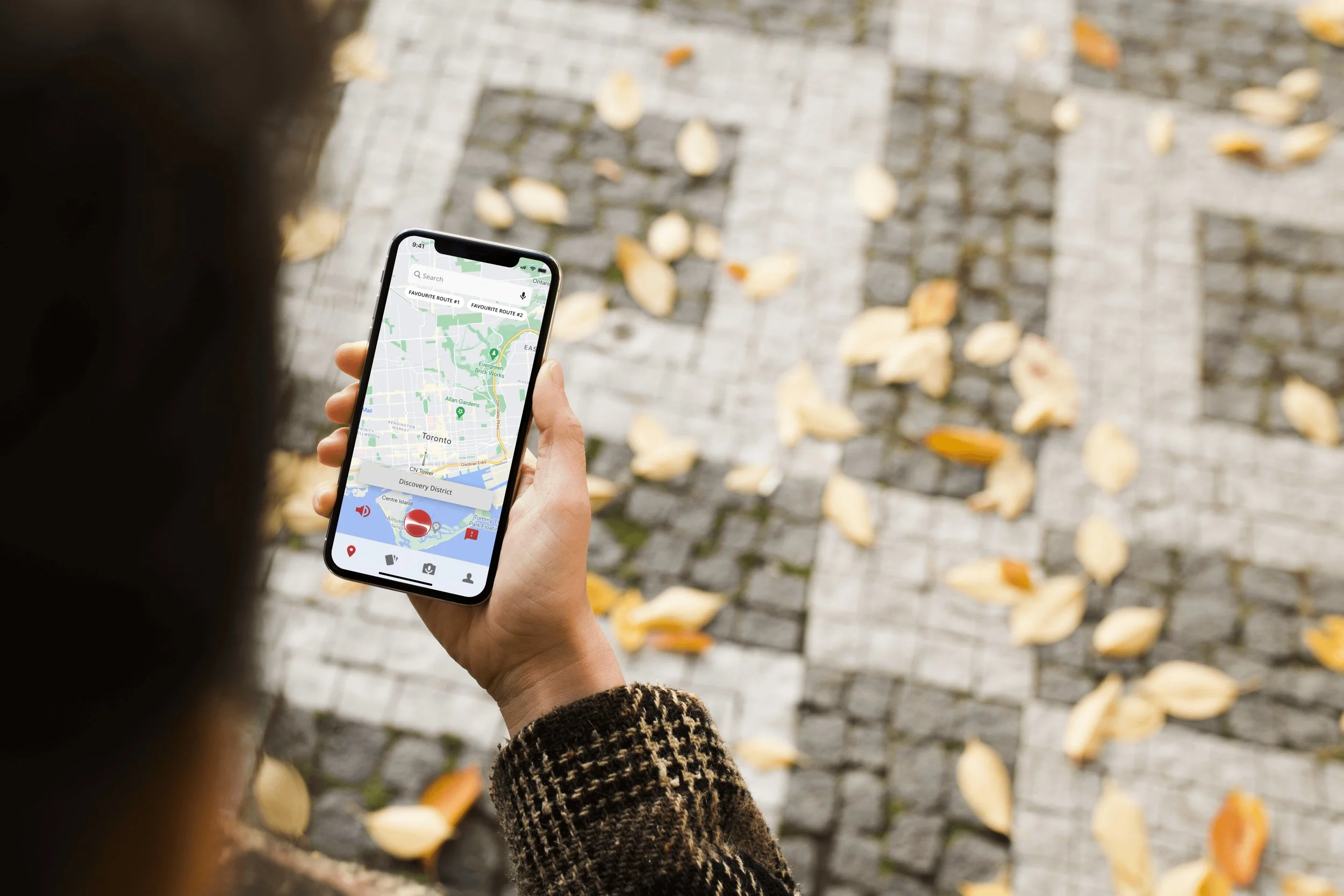
Addressing Public Transportation Accessibility with AccXpress
SKILLS
Prototyping, Interaction Design, Usability Testing, Product Thinking
RESPONSIBILITIES
Conducted user research and developed the product with a team of 3
DURATION
November 2021 - Present (McMaster UI/UX Designathon)
PROJECT SCOPE
I wanted to gain more experience within the design realm so I decided to participate in the McMaster UI/UX Designathon! I teamed up with two like-minded individuals as we were given a prompt to work on, which is addressed in the next section.
PROBLEM BRIEF
Public transportation often fails to meet the needs of users with physical disabilities as they have a struggle accessing vital information that better prepares them to navigate their preferred routes with ease. There is no centralized and trusted source that provides them with this information and they often feel judged when riding public transit.
How might we increase the accessibility of public transportation and connect those with accessibility needs to existing resources that can assist them?
OUR SOLUTION
We decided to design a mobile transportation app that will meet current digital accessibility guidelines so that users with physical disabilities are able to access vital transit information without difficulty.
USER RESEARCH
To get a better understanding of the situation and how to approach it, we began by looking at existing data about accessibility problems within the TTC (Toronto Transit Commission). We found that only 34 out of 69 subway stations in Toronto were accessible and 40% of TTC stations weren’t wheelchair accessible, which created a barrier for many disabled users. To figure out exactly what groups were the most vital, we decided to conduct affinity mapping so that we are able to define the problem better.
AFFINITY MAPPING
From this, we were able to see that the majority of physically impaired users in Toronto were either commuting students or seniors. Mobility and vision stuck out the most in terms of the different types of impairments so we decided to tie that together with our intended age audience and focus on that primarily.
STAKEHOLDER MAPPING
We also identified the relevant stakeholders who would be involved in the process, directly or indirectly on the basis of interest and impact. We felt that physically impaired people and their caregivers were the direct stakeholders with high interest and impact. As indirect stakeholders, the TTC and the City of Toronto would be more involved as well. Thus, who would be our primary users?
PERSONAS
With the personas, we were able to get a better understanding of the wants/needs of our primary users (vision and mobility impairments), as well as the pain points that they might have. This is crucial to figure out what issues the user may have when using public transportation and some of their concerns may even overlap as well, which helps us in the design process.
USER JOURNEY
Based on the primary users and their journey maps, we observed that their anxieties lay mainly during the part of the journey which involved navigating the transit stop, getting into the train, and arriving at the right destination. This allowed us to narrow our focus on existing transit applications for commuters. We also found a few applications that were focused on helping impaired commuters with their transit.
User Journey Map of Tim’s (mobility impairment personas) daily commute
USER FLOWS
After analyzing the situation, we dug into information architecture and created user flows influenced by the scenarios and journeys. From this, we decided to focus specifically on three aspects:
Requiring assistance to find accessible points of entry and exit
Method of communication for any inquiries on how to navigate the subway stations
Finding out the most accessible route for the journey
User Flow of Tim’s (mobility impairment personas) daily commute
WIREFRAMING
Once we had a thorough idea of what our solution would be, we decided to illustrate this with low-fidelity wireframes so we can begin ideating. Here, the sets for the route finder and virtual assistant are shown in their early stages.
DESIGN SYSTEM
In terms of visual identity, we focused on using a clean interface and easily visible colours. We also used an open-source font like Open Sans to make the application easily readable for sighted users. Furthermore, we made sure to check that the red that we used passed contrast guidelines, and is above a 4.5:1 ratio.
FIRST IDEATION (DESIGNATHON SUBMISSION)
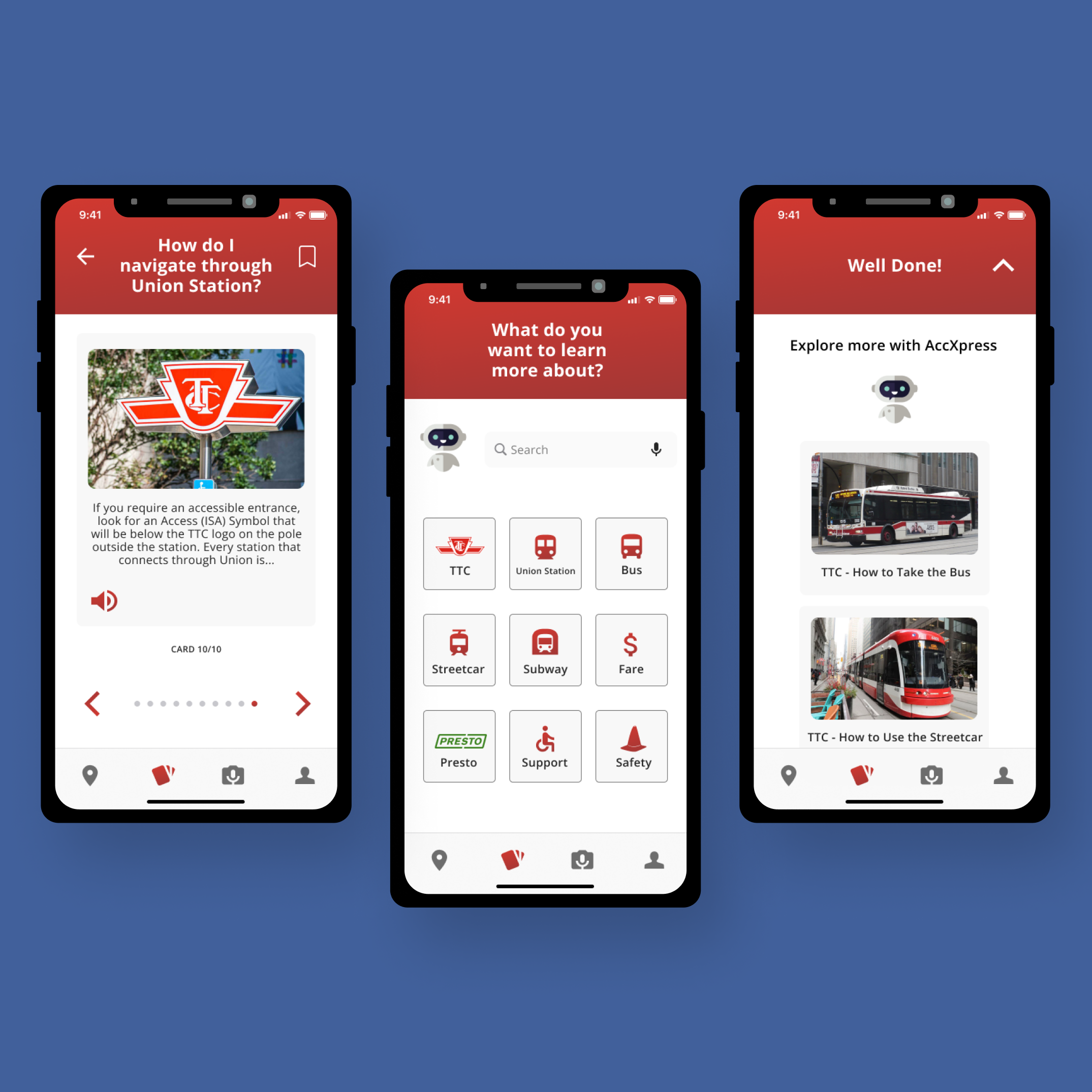
Once we figured out the design system, we spent the majority of the event working on the different screens. Our features are designed for people with disabilities, which include:
Audio guidance to help those with vision impairments
A camera that uses AI to help guide users with visual impairments so that they are aware of their surroundings
Step by step guidance with images to help those with cognitive disabilities
Accessible colours (the red that we use passes colour contrast guidelines <4:5:1>)
Virtual Assistant to take on the role of the “caregiver”, allowing the person with a disability to feel more independent.
USABILITY TESTING
After completing our initial hi-fi, we asked a couple of our peers to test the product as if it was published. We were able to analyze their movements and they were able to provide us with great feedback on things we could improve on. Some of the key takeaways include:
Most of the users that tested our app suggested that we included alternate sign-in solutions with external apps (ex. Facebook, Google)
Users suggested increasing the size of the tab bar at the bottom of the screen since currently, it did not provide enough room for them to select and tap the options with ease
Users suggested that we stick to one primary colour as opposed to having two (originally planned) because some colours do not mix well in terms of accessibility (ex. red and green together)
Ensuring that the user is able to skip the onboarding process and sign in as a guest if they are in a hurry to reach their next destination
SECOND IDEATION (POST-DESIGNATHON)
We were able to win our event with the first ideation shown above so once the designathon concluded, we decided to spend time on our own to further iterate on the app. Since we did not have any time restraints now, we were able to spend more time fine-tuning the design with the feedback that we got earlier.
Onboarding
Route Finder
Cards
Virtual Assistant & User Profile
NEXT STEPS
Over the last two months, I have learned a lot about the design process from working on this solution. As a team, we plan on continuing to create new iterations and see where things go. In addition, some of the features we would like to add in our future iterations include:
Making an interface for smartwatches
Will have a simple homepage where the user is able to access their downloaded cards, their current map route, and routes that they have saved
For the cards, it should be similar to how it looks on the app, but to a smaller degree
If they are following a specific route, the steps should pop up where the user is alerted (either via a map or with steps as shown in the apple watch prototype via the presentation)
Expanding to different parts of Ontario (ex. Durham Region Transit) as the app mainly focuses on Toronto transit


