
Redesigning Nanoleaf’s Smart Device Management System
SKILLS
Prototyping, User Interviews, Product Thinking, Interaction Design, Data Visualization
RESPONSIBILITIES
As a UX Design Intern, I was responsible for all of the duties in the design process as it was a solo project assigned to me at my co-op
DURATION
March 2023 - May 2023
PROBLEM BRIEF
Nanoleaf’s app allows users to manage all of their smart devices in one spot. However, an issue that has been raised was how one of the most important features of the app was being under-utilized. This was the room control view, a feature that allowed a user to control a room’s settings without having to switch to a different app tab. Based on data collected in a span of a week, 117,000 users used the dashboard; out of those users, only 7,800 used the room control view. This equated to less than 7%, which was quite alarming since the room control view feature was intended to make it easier for user to manage their devices.
How might we increase the Nanoleaf app’s room control view usage without compromising the entire device management system?
MY SOLUTION
Using my resources at Nanoleaf, I went through the entire design process to refresh the app’s device management system. This change is projected to increase the usage of the room control view feature while preventing any of the other features from being compromised.

scroll to see how I got there 👇
—DESIGN PROCESS—
PRELIMINARY RESEARCH
After analyzing the data points, I began to not only look at Nanoleaf’s current app but also go into their library and browse past iterations. This allowed me to see how the dashboard got to where it is and see the steps that were taken to create the product that stands today.

COMPETITIVE ANALYSIS
Looking at different platforms gave me different perspectives as to how everyone has different approaches to tackling the same solution. My goal was to observe common practices and dashboard structure. From this, I was able to see that:
How device cards provided multiple functionalities to the user
How the size of the device cards affected… the information that can be stored within it and… how many cards can be present at once at an initial glance

USABILITY TESTING
After diving deep into what I had in front of me, I went out of my way to schedule user interviews. I targeted users from Nanoleaf’s Beta Program since they have much experience using the products. Hence, noted below summarize what was expected from this stage:
Research Goals:
Determine the usability of the current room control view (how are users using it right now)
Figure out how its usage can be improved
Discover any additional pain points within it
Sample List of Questions:
What common actions did they typically do on the app?
Did they prefer to change all of the lights in a room or individually more?
Did they know the intended purpose of the colour access button?
Did they know the difference between rooms and group scenes?
KPIs:
Time-on-task
User Error Rates
From this, users were being interviewed accordingly and noted below are the results from the interviews, which are sorted into different themes

Once I sorted the themes out, I was able to come up with conclusions that would be crucial for the design stage, noted below.

USER JOURNEY MAP
Using the conclusion, I derived a user map that illustrates the user’s path to the room control view feature, which is shown below.

WIREFRAMING

Once I had a thorough idea, I decided to create mockups of different ways to tackle the problem. Here, I present three different versions that all incorporate the features in unique ways.
MID-FIDELITY
After getting feedback from my Nanoleaf peers, I decided to base my solution using elements from all three versions shown above. In this stage, I added more details to the new design.
The main challenge was figuring out what to include in the cards and how big they should be
I changed the design to include an even # of cards per row rather than having an odd # in the wireframing stage
I redesigned the toggle to an on/off indicator, as well as adding the ability to favourite your most used devices

FIRST IDEATION
After figuring out the design's logistics, I spent most of my final weeks at Nanoleaf iterating on the high-fidelity solution. Note that in design, it is almost never that the design is done after the first iteration. Hence, I made improvements with each iteration, which I noted below.
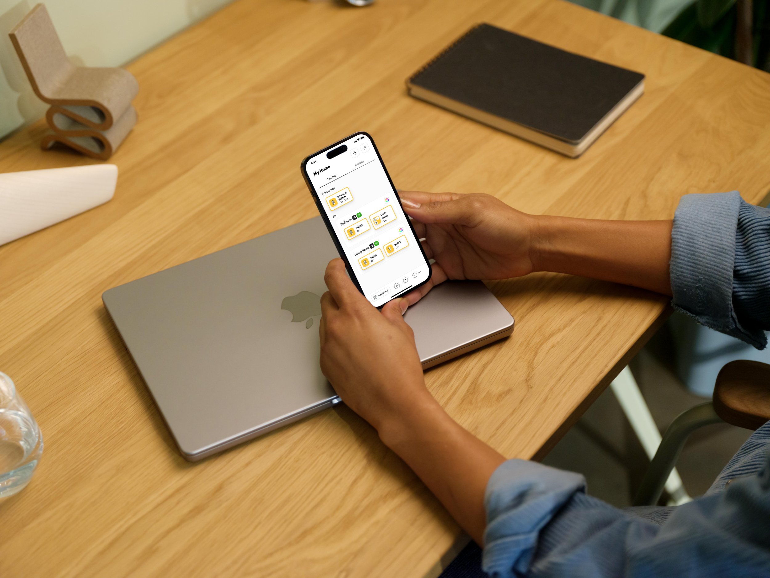
No more side scroll for all cards, cards are lined up in rows of 2 instead
Different size cards available depending on the size of the device name
Redesigned group scenes dashboard to make it more prevalent
Refreshed colour access button to better emphasize room control functions (the colour wheel icon on the dashboard)
Ability to favourite/unfavourite devices with ease

DESIGN RATIONALE

After completing the initial high-fidelity solution, I asked around for feedback on multiple variations of elements that I had trouble deciding on. I was stuck between two choices for the add room/device element in this case. After considering the pros and cons, I went with the second screen as it clears up space for the user’s cards to be present. In addition, it removes one less step that the user has to take as it would be present on the home screen, as opposed to the first screen, which takes two steps to trigger.
SECOND IDEATION
After receiving feedback from my team, I further iterated on the solution, which resulted in various UI changes, noted below.
Removed favourites room card and enabled side scroll for that section so it wouldn’t clump up the entire screen
Add room/device element reworked from design rationale
Room CV now shows all of the devices in the room (if the changes are being applied to the entire room; refer to screens 5 and 6)
Incorporated Sense+ functionality (refer to screen 7)

REFLECTION
With the term wrapping up, I wanted to go back to the question I wanted to look at from the start and analyze the data points that this project addressed

NEXT STEPS
Over the last three months, I was able to immerse myself in a real-world setting and apply my design skills to a product’s feature that has the potential to improve the user experience drastically. Nonetheless, if I was to continue this project still, this is what I would do:
Create a third high-fidelity iteration
This version would primarily address being able to access pre-set scenes from the dashboard quickly
Conducting more user interviews with beta users to see how they fare with the new changes
The main goal would be to analyze the time-on-task and user error rate
Finalizing the designs once the interviews are completed, ensuring it is feasible for development in a realistic time frame.
Analyzing Firebase data once the design has been shipped to see the increased ratio of users who use the dashboard to room cv (currently <7% use room cv, the goal is at least 33%)
The reason why my goal is 33% is that I don’t want to take away from the rest of the features in the device management system. This would drive users away from using those features, which would decrease their usage rates of them overall.